Varmodel AI is a B2B platform that helps companies find and manage strategic partnerships. It features tailored landing pages and a marketplace to connect businesses with key partners and services, streamlining collaboration and accelerating growth.
Duration
6 Months
Role
Lead Product Designer
Project
B2B Partnership Platform
What I did
UX Design, UI Design, Secondary Research


*The projects showcased here provide a snapshot of my design contributions at this company, based on publicly available information. To respect confidentiality agreements, some details have been generalized or excluded. This portfolio aims to demonstrate my design skills and experience.
Other Projects

Academic Project
B2C
E-commerce
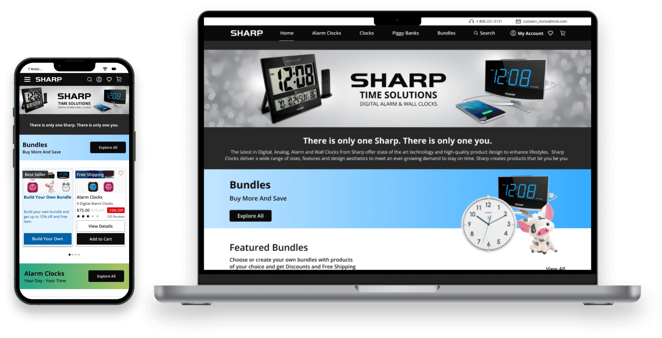
Sharp website redesign
Redesign of Sharp website by integrating e-commerce platforms, SAAS solutions and an innovation for better user experience

© 2024 Designed By Vishal Thakkar
Challenge 02- Introduction to Marketplace Feature
Next, the goal was to generate one-time revenue while introducing a new Marketplace feature, where the CEO aimed to help users discover partnerships directly through the platform. Note: The Marketplace feature case study is presented on a separate page for clarity and ease of understanding
View Marketplace Case Study


01/The Challenge
A homepage that told users what Varmodel offered — but not how to engage with it.
The homepage was Varmodel's primary entry point — and the biggest leak in the funnel. Analytics showed a high bounce rate and minimal engagement with the page's key inputs. Visitors were arriving, not understanding what Varmodel did, and leaving before the product had a chance to sell itself.
Too Many Audiences
Three user flows, AI features, and pricing all competed for attention on a single page.
High Bounce Rate
The site's most-visited page was also its biggest leak in the funnel.
Unclear value
Users couldn't answer the basic question: what does this product actually do?
Weak Calls to Action
No clear next step at any decision point on the page.
02 / AUDIT & ANALYSIS
A heuristic and accessibility audit
revealed a structural problem, not a
surface one.
To move from gut reaction to evidence, I ran a full audit of the site against Nielsen's usability
heuristics and WCAG accessibility principles. Roughly 60–70% of the site was violating one or more
core principles — primarily around information overload, poor color contrast, unclear hierarchy, and
content that added complexity without adding user value.
01
Heuristic Violations Across 60–70% of the Site
Audited against Nielsen's usability heuristics; most core screens
violated one or more principles.
02
Accessibility Gaps in Contrast and Hierarchy
WCAG-level issues around color contrast, typographic hierarchy,
and content density.
03
Information Overload as the Root Cause
Every section added content without adding clarity — the
homepage needed less, not more.

"The homepage didn't need new
features. It needed less."
Design Strategy
Three principles shaped every decision in the redesign.
Clarify Before Decorate
Rewrite headers and content to answer what Varmodel does and who it's for — within seconds of landing.
Build a Real Design System
Consolidate fragmented typography, color, and spacing into a scalable system the whole team could use.
Guide Each User Intentionally
Separate the three user flows so each audience could find their path without competing for attention.
Before & After

BEFORE
Dense copy without hierarchy
Unclear calls to action
Imagery that didn't support the message

AFTER
Clear entry points for each user group
Stronger CTAs at every decision point
Visuals that reinforce the copy
Information Architecture
Before touching the layout, I mapped the journey I
wanted each user group to take from landing to action. It
became the blueprint for what content appeared on the
page, in what order, and with what weight.

Design System
Varmodel had the raw ingredients of a visual identity but
no system tying them together — consistency was
accidental. I consolidated typography weights and line
heights, defined color usage rules, built a shared
component library, and documented spacing and layout
guidelines.

03 / THE EXECUTION
Homepage
Redesign
With the design system and user flow in place, I
redesigned the homepage around a single guiding
principle: less, but clearer. Every section on the new page
had a reason to be there, and every user group had a
clear path forward.

04 / BROADER PRODUCT WORK
Beyond the Homepage
The homepage redesign was one part of a larger mandate. Over the six months, I also designed the
core SaaS product experience — the platform where partnerships actually happen.
Onboarding & Profile Creation
End-to-end signup and profile setup, capturing each
user’s role, goals, and partnership preferences — the
inputs feeding Varmodel’s AI recommendation engine.
Designed to balance data depth with drop-off risk.
Service Seeker & Service Provider
Profiles
Two profile types serving fundamentally different
purposes — one for signaling what partnerships a user is
looking for, one for showcasing offerings and building
trust. Rebuilt around signals identified through
competitive analysis of adjacent B2B platforms.
Partnership Discovery & Connection
Flow
The core matching experience — browsing potential
partners as cards (featuring companies like Google and
Meta), evaluating fit, and initiating outreach through a
LinkedIn-style connection flow.
Marketplace Posting & Discovery
The surface supporting Varmodel’s first one-time
revenue stream through Featured Listings — where
Service Providers post partnership offers and Service
Seekers browse and reach out.
Visuals from this work are not included due to NDA, but I’m happy to walk through specific flows and decisions in an interview.
05 / THE OUTCOME
The Outcome
FOR USERS
A homepage that answered its
most basic question — what
Varmodel does and how to
engage with it — within seconds of
landing. Each user flow had a
clear entry point, and every
section had a reason to be there.
FOR THE BUSINESS
Stakeholders approved the
redesign for A/B testing against
the original, and the Marketplace
feature — including a one-time
revenue stream through Featured
Listings — was greenlit for beta
launch on the back of this work.
FOR THE TEAM
The consolidated design system
became the shared source of
truth for all future design and
development work. Onboarding
new team members became
faster, and visual consistency
stopped being a recurring issue.