+

We partnered with Karma Dharma to evaluate and improve the user experience of fight.org. By identifying key pain points through user journeys and analytics, we uncovered major conflicts in navigation, donation trust, and care access. Our solutions focused on role-based pathways, mobile-first design, and clearer content structure to help users take meaningful action.
Duration
32 hours
Role
UX Researcher
Project
NGO Website Redesign
What I did
UX Research, Secondary Research, Preto Persona, Journey Mapping, Data analytics review, Information architecture,
solution recommendation

*The projects showcased here provide a snapshot of my design contributions at this company, based on publicly available information. To respect confidentiality agreements, some details have been generalized or excluded. This portfolio aims to demonstrate my design skills and experience.
Why We Took This On?
Karma Dharma came to us with a concern:
Despite offering critical health services and opportunities to support their mission, their website wasn’t helping people engage. Donations were low, care-seeking patients were frustrated, and professionals found no way to get involved.
Goal
Our research aimed to uncover the root causes of user frustration and provide strategic solutions that could guide the future redesign. The four main goals were
1. Identify key friction points in the current user journeys across all four core user types.
2. Understand how users navigate and engage with the site using analytics and behaviour mapping.
3. Develop actionable insights to guide a redesign focused on clarity, trust, and accessibility.
4. Create role-specific recommendations that support donors, patients, professionals, and researchers effectively.
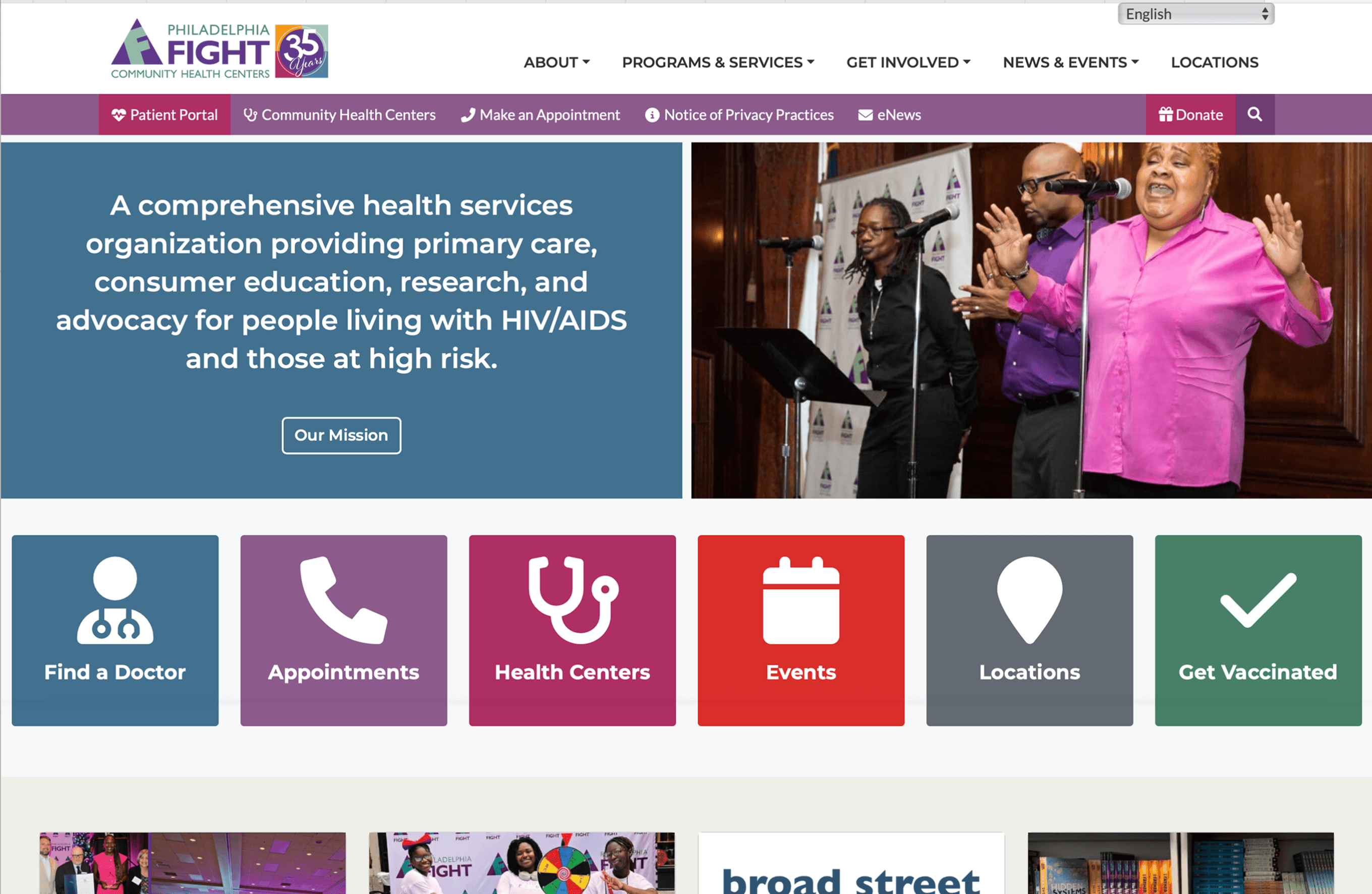
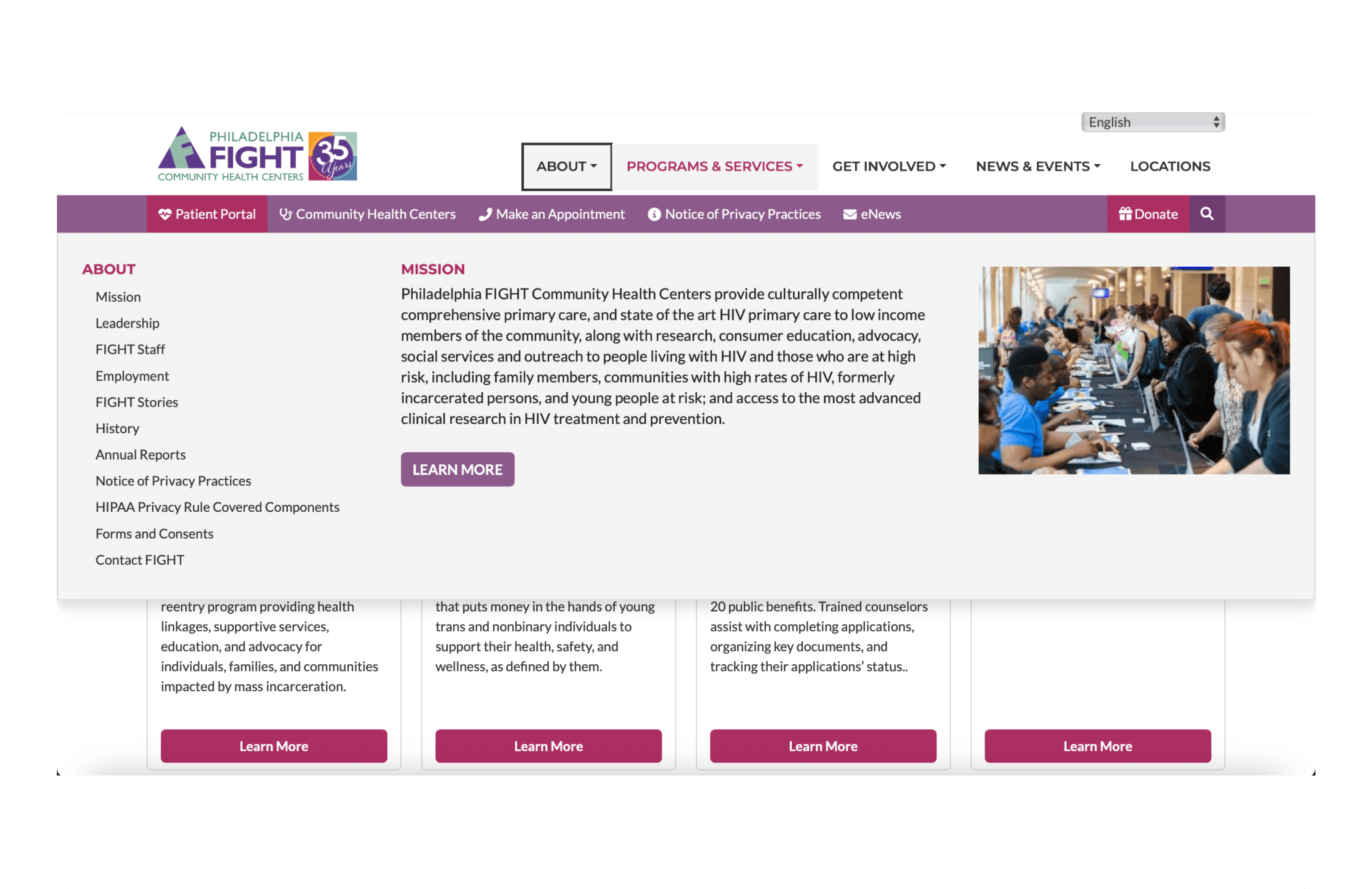
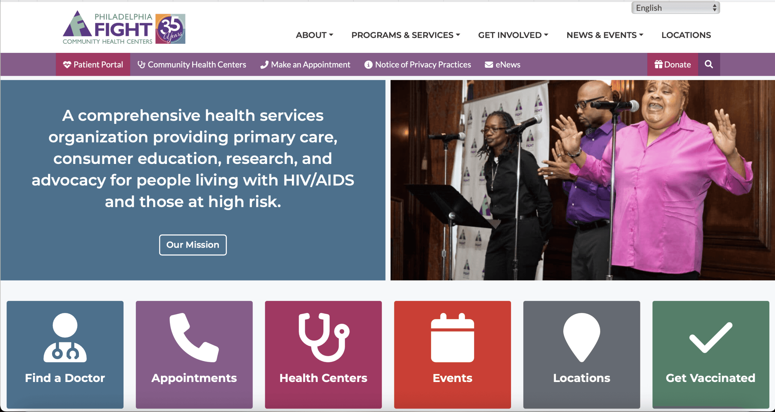
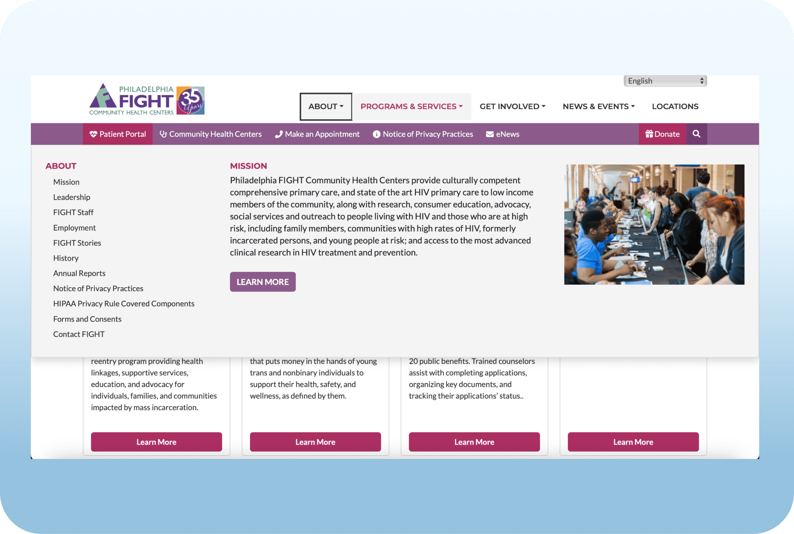
The Problem
Despite offering vital health services and community programs, fight.org was not effectively supporting its users. The website lacked clear navigation, role-specific content, and emotional engagement—resulting in poor usability and low user retention.
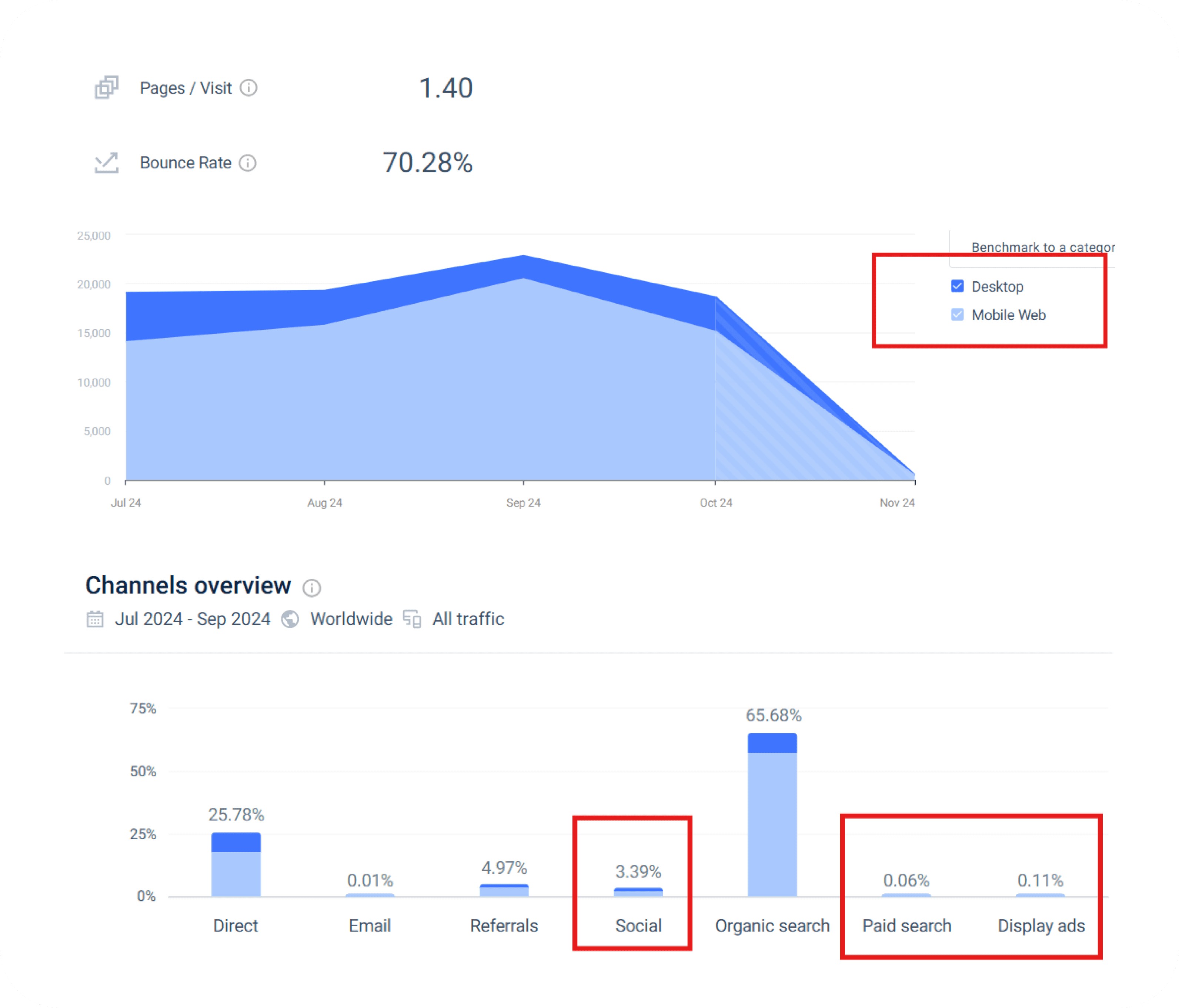
Key Data Insights from Analytics:
Bounce Rate:
Current: 70.28%
Industry Standard (Healthcare): 58.29% – 59.44%
Ideal Bounce Rate: 40% or lower
❗ High bounce rate indicates users leave after viewing only one page—often the homepage.
Pages per Visit:
Current: 1.40
❗ Users are not exploring deeper content or navigating beyond their landing page.
Device Traffic:
Majority of traffic is from mobile users
❗ Poor mobile usability, slow load times, or unclear navigation could be deterring users quickly.
Breaking Down the Problem
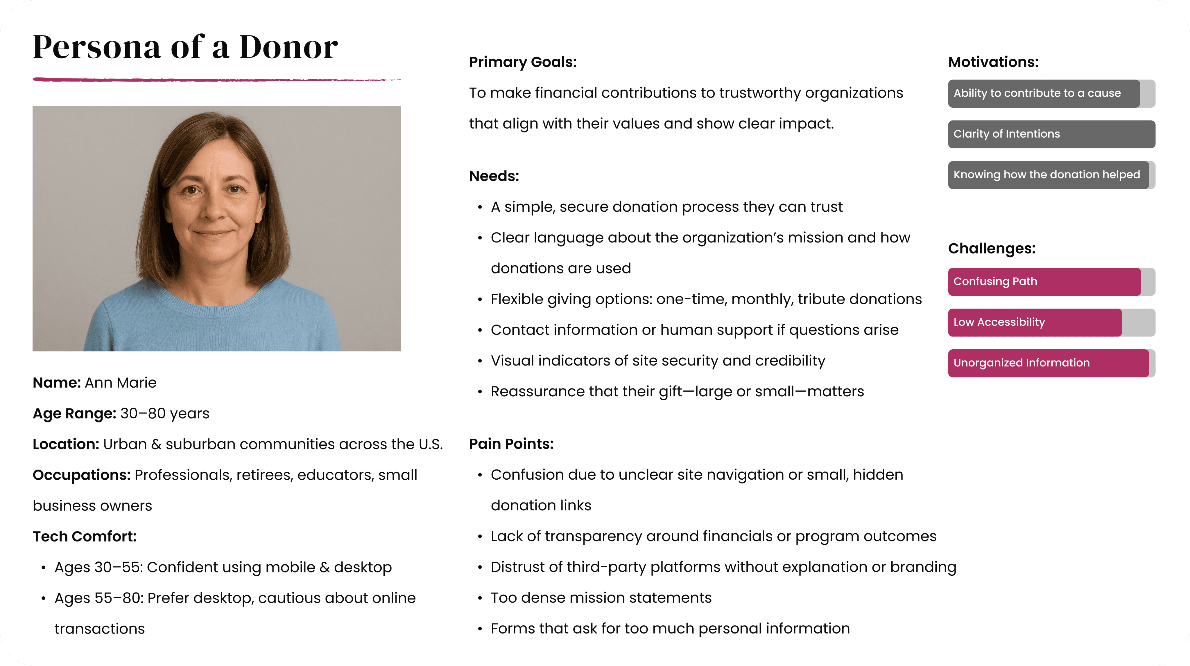
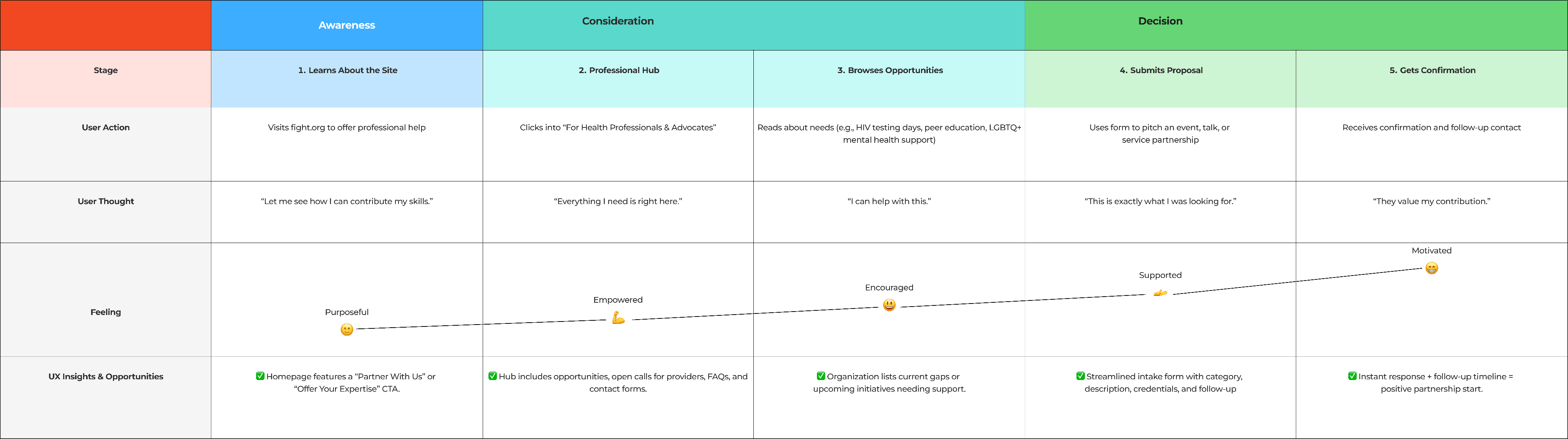
With the data received from analytics and stakeholder input, I began breaking down the core usability issues affecting each user group. Since there was limited time and no access to real users for interviews, I used a heuristic evaluation approach to simulate user behaviour. To do this, I created four detailed proto-personas based on stakeholder assumptions, web content, and behavioural patterns observed in analytics. Then, I mapped out their likely journeys through the current site—highlighting moments of confusion, friction, and dropout.
This helped me evaluate the experience from the lens of:
1. A donor seeking trust and clarity
A patient looking for quick, inclusive access to care
A health professional exploring ways to contribute
A researcher hoping to collaborate and access impact data
Doner
User Journey Before
After creating the proto-persona for a typical donor, I explored the website from their perspective—focusing on trust, clarity, and ease of donation. Using insights from Nielsen Norman Group’s research on donor behavior, I mapped out the current user journey to identify key pain points and moments of drop-off.

Strength
While analyzing the donor experience, I also identified several strengths in the existing website. These elements aligned with usability best practices and provided a strong foundation to build on in the redesign, which are mentioned below
Dedicated Donation Page
Program-Level Fund Designation
In-Kind Donation Support
Trust Signals

Areas of Improvement
Alongside the strengths, I identified several areas where the current experience falls short. These issues created friction for users and contributed to confusion, low engagement, and missed opportunities to convert interest into action
Homepage: Lack of Donation Impact
Emotional Engagement
Donate CTA Visibility
Lack of Third-Party Payment Clarity
Financial Transparency Not Front-and-Center
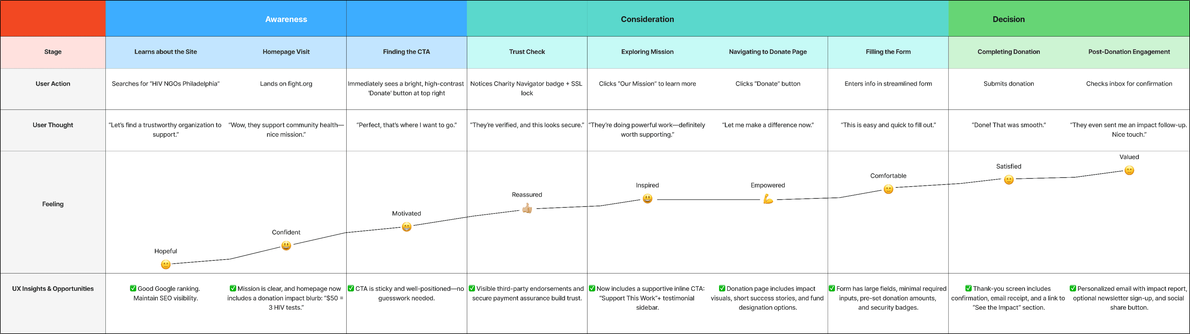
User Journey After
Based on the identified pain points and research insights, I reimagined the donor’s user journey to create a more intuitive, engaging, and trust-building experience. The updated flow focuses on guiding the user with clear calls to action, emotional connection, and simplified donation steps.
Patient

User Journey Before
After creating the proto-persona for a typical patient, I explored the website from the perspective of someone urgently seeking care. With limited digital comfort and high emotional stress in mind, I mapped the user journey to uncover gaps in access, clarity, and support
Strength
While reviewing the patient experience, I identified a few strong elements that support discoverability and community presence. These provided a helpful baseline for expanding and refining the care-seeking journey.
Mission-Driven Brand with Strong Community Presence
Visible and Diverse Programming
Basic Volunteer Infrastructure Exists
Areas of Improvement
Despite its strengths, the site presented several barriers for patients trying to access care. From unclear navigation to missing cost details and limited mobile support, these issues risked leaving vulnerable users without the help they needed.
Lack of Condition-Based Navigation
Unclear Service Descriptions
Confusing Doctor Directory
Repetitive and Disorganized Content
No Centralized Entry Point for Patients
No Personalized or Recommended Care Paths
Poor Contact & Support Experience
Lack of Emotional Comfort or Human Touch
User Journey After
Guided by the pain points and goals of the patient persona, I restructured the experience to focus on clarity, accessibility, and action. The improved journey offers a simplified care path with condition-based entry points, mobile-friendly support, and clearer communication.
Note:* This case study highlights the experience of two primary user types: Donors and Patients. To explore the full analysis, including Health Professionals and Research Partners, click below to view the complete presentation.
View Full Presentation
Translating Data into Insight
After establishing the initial performance concerns through analytics, I used persona-driven journeys and a heuristic evaluation of the website to better understand why users were leaving and what was preventing engagement.
From exploring the site as a donor, it became clear that:
The donation process lacked emotional appeal, impact clarity, and trust signals.
CTAs were hard to find, especially on mobile.
There was no reassurance that the donation would make a difference.
Patients needed quick help, but the site was overwhelming:
No clear starting point for care
Services were buried or full of jargon
Mobile experience lacked accessibility and support

Recommended Solutions by User Group
To address the issues uncovered through data and journey mapping, I proposed a set of targeted UX improvements—focused on building trust, clarity, and mobile accessibility for donors and patients.
01
02
03
04
For Donors:
Add a bold, persistent “Donate Now” button (top-right & sticky on mobile)
Include impact breakdowns, testimonials, and donation examples
Highlight secure payment badges and nonprofit credentials
Simplify donation forms with mobile-first layouts and optional fields
For Patients:
Launch a “Get Care Now” landing page as a centralized entry point
Organize care services by condition, population group, and eligibility
Add tap-to-call buttons, maps, service hours, and clear cost information
Use plain, welcoming language with visual cues and reduced jargon
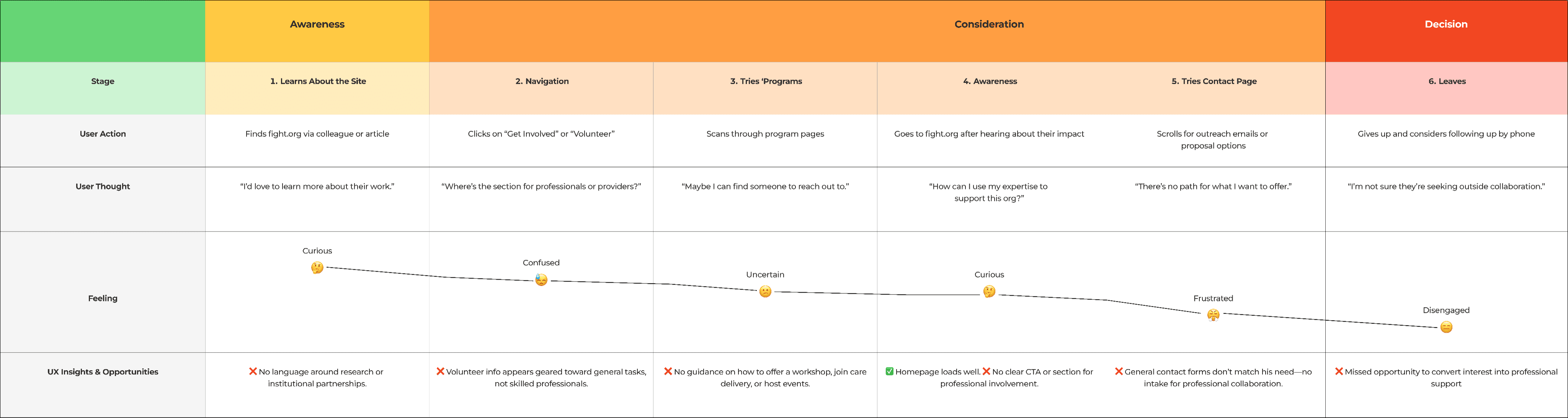
For Health Professionals:
Create a “For Professionals” section outlining ways to contribute
Add a submission form for volunteering services or proposing programs
List current needs (e.g., “We’re looking for volunteer therapists”)
Include direct contact info for each program, not just a general inbox
For Research Partners:
Build a “Research & Partnerships” portal
Include downloadable impact reports, past studies, and publications
Provide a clear overview of IRB/compliance policies
Add a form for proposal submissions with basic project info fields
Note:* This case study highlights the experience of two primary user types: Donors and Patients. To explore the full analysis, including Health Professionals and Research Partners, click below to view the complete presentation.
View Full Presentation
Expected Results & Impact
While the redesign has yet to be developed, the proposed research-backed solutions are expected to bring measurable improvements across the board:
Reduce Bounce Rate:
By streamlining navigation and adding clear, persistent CTAs for core actions like “Donate” and “Get Care Now”, the site is expected to lower its bounce rate significantly—from 70% to under 50%
Increase Engagement & Conversion:
Role-specific pathways and simplified content will encourage users to explore more pages and complete key actions, such as:
Making a donation
Booking an appointment
Submitting a partnership proposal
Build Trust and Accessibility:
Improvements like impact transparency, secure donation flows, condition-based care organization, and mobile-first layouts are designed to:
Increase donor confidence
Make healthcare more accessible
Encourage professional and academic collaborations
Align Site Structure with User Intent:
The redesigned information architecture supports faster access to services, reduces cognitive load, and enables users to self-identify their path quickly—leading to more efficient, goal-driven experiences.
What I Learned
This project taught me the power of combining data, empathy, and structure—especially in a nonprofit context where user needs are urgent and diverse. I learned how to:
Analyze journeys without direct user interviews
Break down complex problems into targeted, role-based solutions
Design for clarity and emotional connection—equally
Other Projects


© 2024 Designed By Vishal Thakkar